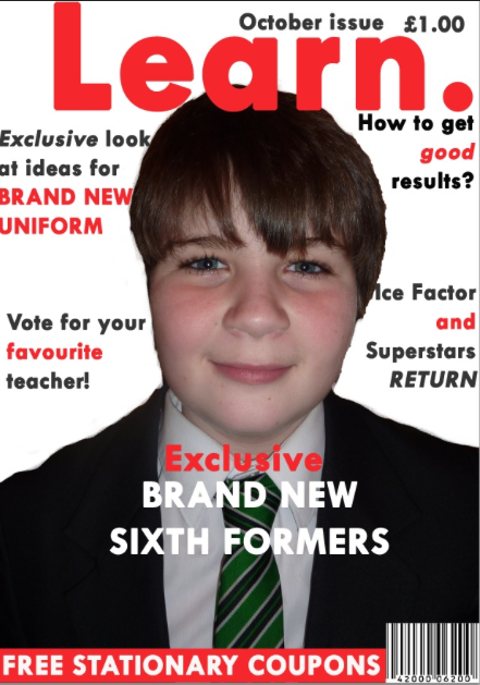
This magazine is asymmetrical because it has the photo on one side and all the stories on the other. This is also balanced because not everything is on one side. There is bold writing tot try and draw attention away from the model/celebrity.
This magazine is not symmetrical but the photo is symmetrical. All the writing is on the left side and the celebrity/models name is on the right side. To try and make the magazine cover balance she is facing the right side.

This is radial balance because it has the person in the middle with all the headlines and story's around the outside. The stories are in a ring shape around the picture in the middle.
This magazine is asymmetrical by texture because they have all the main stories on the left side. But the model/celebrity has a very busy looking tattoo. This is to build up texture on the right side.
This is a magazine that is asymmetrical by colour because it has bright coloured writing on the left side and has plain white writing on the left side. This brings more attention to the left side because it is more i catching.
This asymmetrical by value because the black and white contrast at the bottom is more eye catching. However the top of the cover, where the white has faded grey. This makes the model/celebrity's hair stand out more.
GREEN
Really good piece of work with the right amount of detail and analysis. Well Done.


No comments:
Post a Comment